UI Components
Framework-agnostic Lit Web Components and the mountDevWallet helper, with CSS theming
The dev wallet ships Lit Web Components for wallet management UI. These work in any framework — React, Vue, vanilla JS, or anything that renders HTML.
Quick start: mountDevWallet
The simplest way to add the wallet UI:
import { mountDevWallet } from '@mysten-incubation/dev-wallet/ui';

// Mount the floating panel (default: appends to document.body)
const unmount = mountDevWallet(wallet);

// Mount into a specific container
const unmount = mountDevWallet(wallet, {
	container: document.getElementById('wallet-root'),
});

// Clean up
unmount();
The wallet panel
The <dev-wallet-panel> element renders a compact wallet dock in the bottom-right corner. Clicking
it opens a slide-out drawer with tabs:
- Home — active account, SUI balance, and coin balances
- Objects — owned NFTs and objects
- Settings — network switching, wallet configuration
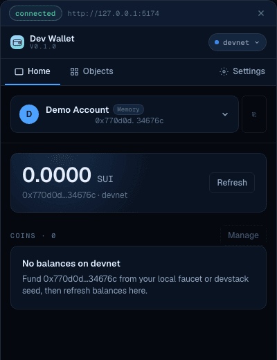
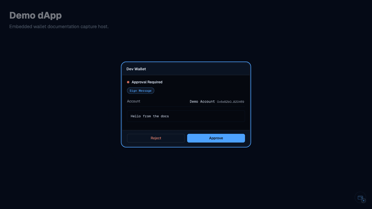
The panel also shows the signing modal when a request is pending.
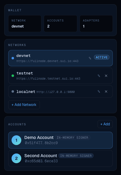
Settings tab
The Settings tab lets you manage networks and accounts:
Component catalog
| Component | Description |
|---|---|
<dev-wallet-panel> | Full floating panel with dock trigger + drawer |
<dev-wallet-accounts> | Account list with selection and management |
<dev-wallet-balances> | Coin balances for the selected account |
<dev-wallet-new-account> | Create account form (adapter picker + label input) |
<dev-wallet-signing> | Signing request display with approve/reject buttons |
<dev-wallet-signing-modal> | Centered modal overlay for signing requests |
<dev-wallet-objects> | Owned objects grid |
<dev-wallet-settings> | Network management and wallet settings |
<dev-wallet-connect> | Account picker for connect requests |
<dev-wallet-account-selector> | Account selection dropdown |
<dev-wallet-network-badge> | Network indicator badge |
<dev-wallet-fork-panel> | Fork controls (advance clock / checkpoint, status) |
Using components directly
All components accept a wallet property:
<dev-wallet-panel></dev-wallet-panel>

<script type="module">
	import { DevWallet } from '@mysten-incubation/dev-wallet';
	import '@mysten-incubation/dev-wallet/ui';

	const panel = document.querySelector('dev-wallet-panel');
	panel.wallet = wallet;
</script>
Styling
Components use Shadow DOM and CSS custom properties prefixed with --dev-wallet-*. They render in a
self-contained dark theme that doesn't interfere with your app's styles.
Customizing colors
Override CSS custom properties on the host element:
dev-wallet-panel {
	--dev-wallet-primary: #4da2ff;
	--dev-wallet-background: #05080f;
	--dev-wallet-foreground: #e6eefb;
	--dev-wallet-border: rgba(255, 255, 255, 0.07);
}
Available CSS custom properties
Colors:
--dev-wallet-background— panel background--dev-wallet-foreground— text color--dev-wallet-primary— accent color (buttons, links)--dev-wallet-primary-foreground— text on primary--dev-wallet-secondary— secondary backgrounds--dev-wallet-muted— subtle backgrounds--dev-wallet-muted-foreground— subtle text--dev-wallet-destructive— danger/reject color--dev-wallet-positive— success/approve color--dev-wallet-border— border color
Layout:
--dev-wallet-radius— base border radius (default:6px)
Typography:
--dev-wallet-font-sans— body font family--dev-wallet-font-mono— monospace font family--dev-wallet-font-weight-medium— medium weight (default:500)--dev-wallet-font-weight-semibold— semibold weight (default:600)